i wasn't exactly thrilled with this cover. absolutely LOVE the image at the bottom, but the guy baffled me. anyway, apparently some people at the publishing house weren't crazy about the guy either, so the cover was changed to this:

this is the new, finished cover. I think the concept for the new cover was solid, but... I actually think the original is the better cover simply because the artwork in the second is...well.... i keep looking at it, thinking maybe my eyes are playing tricks on me and i'm simply not seeing what's supposed to be seen. i see an actual
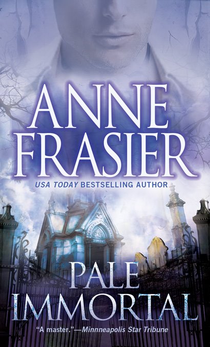
1/4 inch gap between the head and "neck" where the overlays didn't match up.
i've learned another lesson here.

33 comments:
Rest assured that it's a shirt collar, but you do have to really look at it to think it's not a neck gap. ;D But the right corner of the collar looks like it's blended. It's tough to distinguish.
I don't think romance when I look at it!!
I like the new cover. Looks great!
Yeah, the guy, that's just weird. And you don't write romance. Think your publisher knows that?
sandra said, "and you don't write romance."
Man, I thought you did ;)
I like the second one better because there is more focus on the lower image and less concentration on the upper image. Too bad you can't get rid of the guy altogether.
For some reason, the guy's smile makes me think of kermit the frog...i don't know why.
The smaller version you added to your sidebar really puts it in perspective, though.
Overall, I think its an improvement. I really like the bottom of the cover. That really falls in line with the feel of your books as well as your previous covers.
Could be worse...when I first saw the cover of the Hardcover version of The Devils' Right Hand, I asked "why is Michael Stipe [lead singer of REM] on the cover of my book?"
Like you, I wasn't thrilled with the first cover, and to be completely honest, I think this second cover is worse. The image at the bottom is great by itself. In my opinion, it would be better if they completely removed the guy from the cover. Why does he need to be there, anyway?
I can also see the 1/4 inch gap you're talking about.
I have to admit that I'm anxious to read the book to see how the guy fits in. I don't get it from the cover.
And I see a gap too. A couple of my friends are graphic artists; they hate it when they run with something that didn't sit right. Maybe that's what happened here.
kelly, i wondered if that was supposed to be his collar! or possibly a goiter.
sandra and emeraldcite: i'm glad you like the newer version! i think they put a guy on the cover in hopes of drawing romance readers. some might like it, but i'm afraid many will find it too graphic.
jd: i had to go look at the cover on amazon. LOL! at least it's stipe before he got skinny and strange. :D
jeff: i appreciate your honesty!
stay-c: what is so strange is that this wasn't a cheap cover. it has foil, and the back is soft paper. i just don't get it. i saw an early copy of cover 2, and i didn't realize it was FINISHED. i really expected them to make the artist correct number 2, or go back to number 1.
oh, and something else that's weird: now that i have the actual cover in hand, i see that the mausoleum has an actual name on the front and also a star. neither have anything to do with the book.
maybe the artist put his/her own name on it...
Stipe was always skinny and strange...
;)
emeraldcite: ER, i should have said ER. :D
Anne, of the two, I prefer the new one. The first just looks too Brokeback Sarcophagus. If I could have my wish, though, they would raise your name/blue field to the top, lose Christopher Reeve, and fill in the space above the mausoleum with tree branches.
Brokeback Sarcophagus
OMG!!!
LOL!!
and emeraldcite made a good point -- the second cover at least shifts the focus to the bottom.
okay, i've spotted the cover flat from a distance and from different angles and i think it looks pretty good. sometimes you can't see the guy at all because of the foil. i think the second cover is better. from a distance, it's very much like the hush cover, which is one of my favorites.
Anne,
I like the second cover, probably for the same reason Jason did - the guy on the first cover is just too pretty, too "romance" for my taste.
Second cover, the lips are, um, disturbing, disquieting? A male Mona Lisa? I like that I'm not sure what to make of him... that fits with the title, don't you think?
What's with the goiter?
Seriously, I wouldn't have noticed if you hadn't pointed it out. I like this cover much better, but do think the guy is completely unnecessary.
Rob
Mark and Rob: thanks for the input. the cover is definitely growing on me. from a distance it looks really good -- and how a book looks from a distance is important. it will be interesting to see if the guy sells more books.
Looks good to me!
thanks, jude!
and welcome to my blog. :)
jude... one of my favorite names. must use it in a book....
Yeah, that looks like a shirt collar to me too. The cover rocks, Anne! I love it.
If it's a shirt collar, then the guy must be a cleric.
Okay, cynicism aside, I love the cover except for this collar-thingy. Glad it looks good in person. And I can't wait to read it. Jer
tanya and jer: thanks! seems like the reaction to the cover has been mostly positive, which is a big relief!! covers are SO damn important.
I like both. The first one didn't strike me as romance because there wasn't a ripped bodice or freshly waxed pectorals.
The second one looks a little odd because his neck seems a tad big.
Statistically speaking, viewer attraction and recall always spike up when there's a human element on the cover. Doesn't always translate to sales, but worth noting. (Sorry. Too much marketing in my blood. It's a sickness, I know).
Both look great, but I prefer the original. Can't wait to see it with the metallic ink.
jamie, i've never heard that about attraction and recall -- it's great getting your marketing perspective. both hush and sleep tight had people on the cover and sold better than the books without people. what's interesting is that i actually wanted them to put a person on the play dead cover. I suggested a closeup of someone wearing sunglasses, a tombstone reflected in the lens. i still think that could have worked, but at that time they wanted to move away from people.
Speaking as someone who has had THE SAME COVER on two of my books, I'm impressed by any art department that puts up two covers for ONE book. I don't care if they're crap or not -- at least you know you haven't read the book before if you look at the cover.
I prefer the first cover, Anne. The guy, since apparently he has to be there, looks less stilted. Just MHO, though.
And thanks for dropping by my blog. You can say 'whoring' there any time you want!
And this one of yours isn't crap. I love the eerie feel of it -- guy or not.
thanks, anne! i'll be back for more whore talk. :D
I prefer the second one. The guy on the first cover reminds me of Tom Cruise with no ears.
Also, I just LOVE the colors!
neinke: welcome to my blog. :)
last night i FINALLY noticed that the guy looked like Tom Cruise! and that he had no ears!! i actually looked in the mirror to see where my ears started. :D
i think maybe that IS tom cruise.
too bad they can't move your name up and increase the size of the image, or shift it a little more.
Of course, your name is huge, which places a lot of faith in recognition. That's faith in your ability to sell.
that's my bright side for the day. back to our regularly scheduled curmudgeon.
emeraldcite: it's is strange how the name size often signifies how well a writer has done. a new writer usually starts out with a huge title and the writer's name in small print at the bottom. then everything slowly shifts as the name begins to build.
Hey, you simply have to count your blessings that TC won't be on the cover.
Eeeew.
i really wonder if TC is why they changed the cover.
the only thing better would have been michael jackson.
heh
Post a Comment